Brand Identity
Brand Identity
Branding & Design
A business stands out not only for its products or services but also for how it presents itself. Corporate identity is what gives a brand substance and character. It is how your business is perceived by customers, partners, and the broader public.
Corporate identity encompasses all elements that express the personality, values, and philosophy of a brand, from the logo and colors to the way it communicates with its audience and its overall image in the media.
At DigitalUp, we place great importance on creating a corporate identity that not only stands out visually but also serves the strategic goals of the business. We ensure that every visual and verbal element is harmoniously aligned with the company’s culture and reinforces its brand recognition.
We use color palettes, distinctive graphic patterns, clean design lines, and consistent communication to create a comprehensive image that stands out in the market and builds trust. A strong corporate identity is not just about the look; it is the foundation upon which the relationship with the audience and the long-term success of the business are built.
Choose one of our Projects
Azera
A new era of Holistic Care
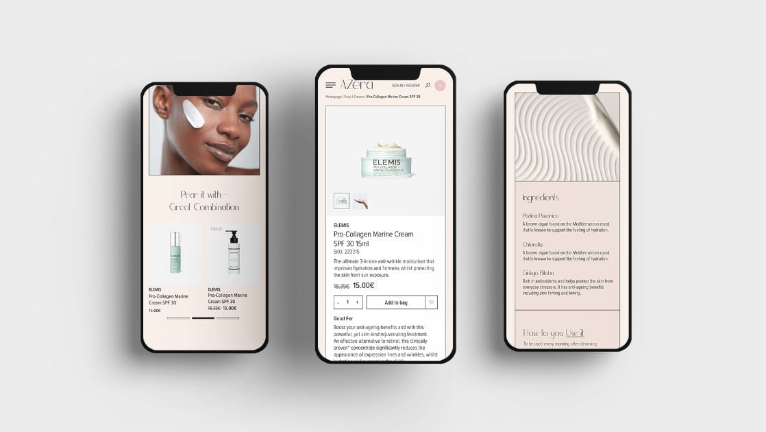
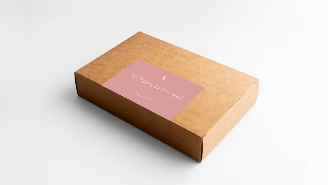
AZera’s philosophy is to bring out the best version of yourself through a premium experience and a holistic A-Z care of its luxury beauty care products.
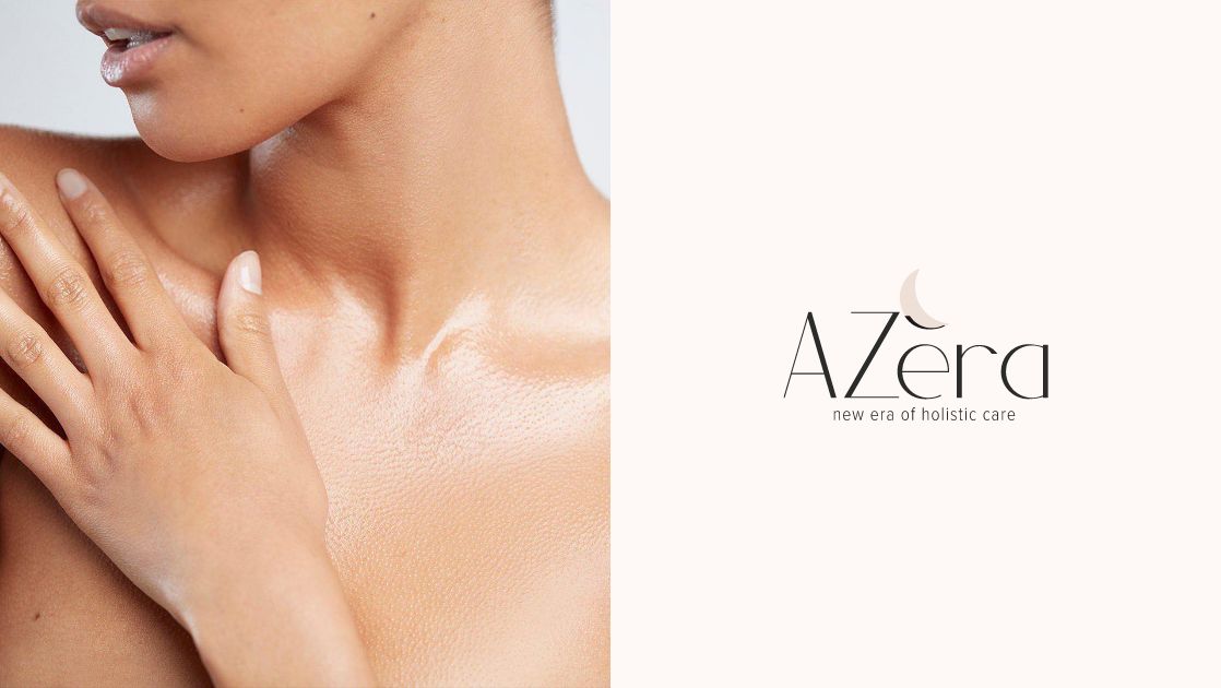
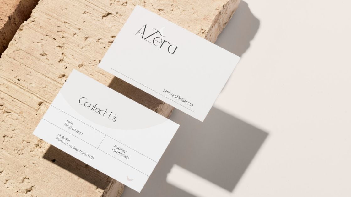
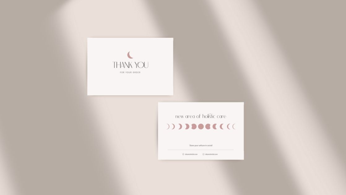
The predominant nude tones indicate the naturalness of self care and clean skin. The integrated care that the person receives is expressed in the moon of the logo. A moon, which manifests the completion that one feels after a proper day of beauty care, as well as the new favourable beginning found ahead.
Dimorea
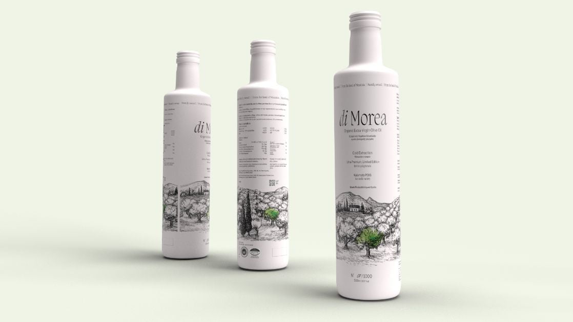
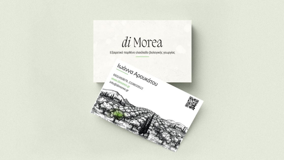
From the heart of the Peloponnese to the tables of those looking for quality in their diet. The organic extra virgin olive oil di Morea represents everything that is found in the Greek tradition.
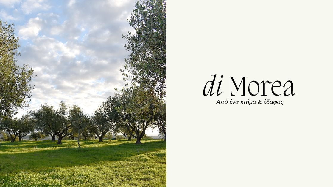
Respect for the natural-resources, purity, flawless quality & traditionally following all stages of the production process are the main pillars on which both the product itself and the brand behind di Morea were built. The curves of the logo are driven by the convexity of the olive fruit while the edges of the logo’s font represent the roots of an olive tree, therefore the roots of a family where their philosophy stands on.
Kazi Line
We love curves
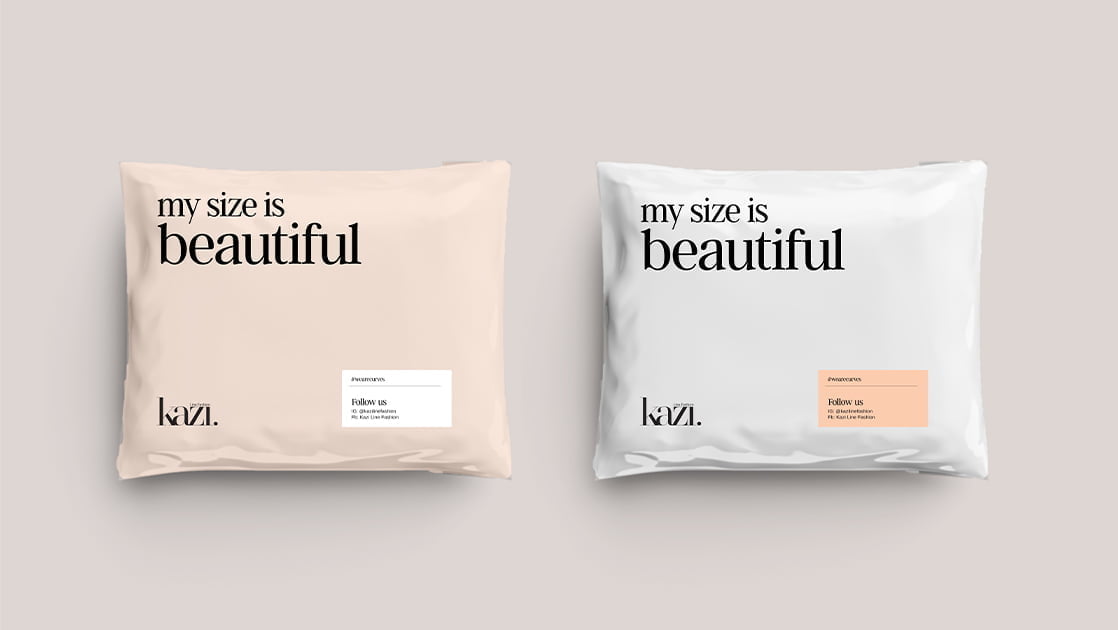
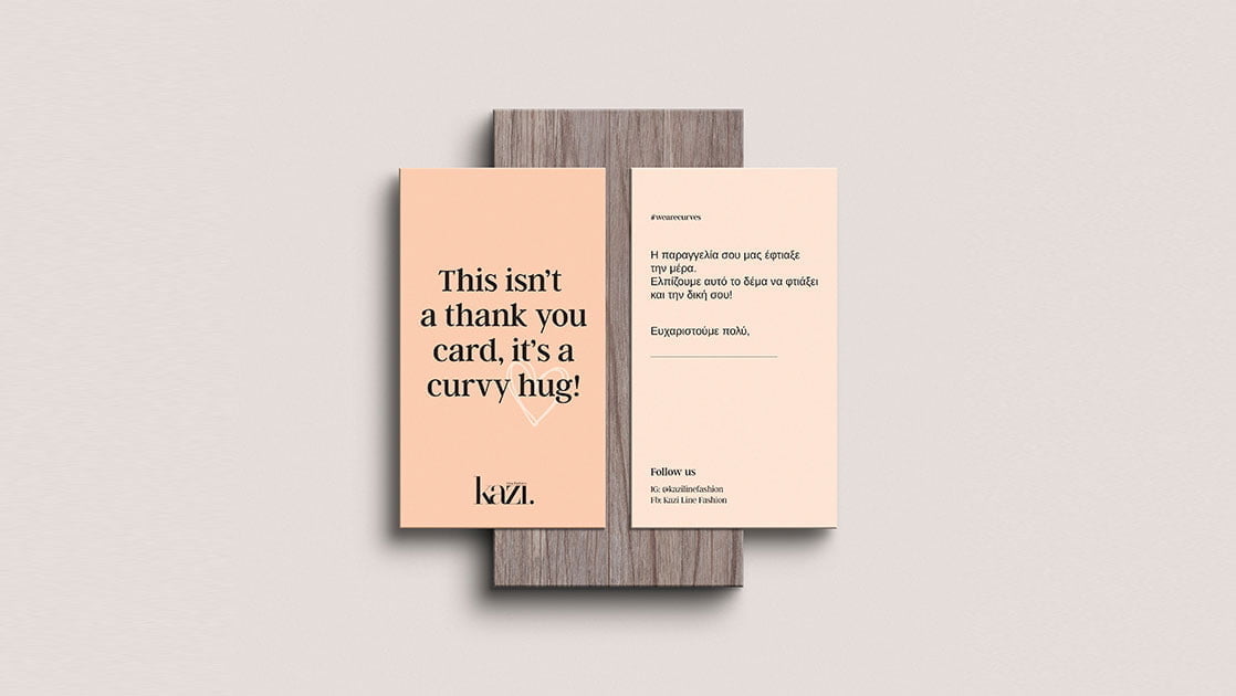
For the woman who doesn’t go unnoticed, for the one who laughs a lot, for the one who knows that femininity, beauty and expression fascinate and transcend in every size. The Kazi Line Fashion brand was built around a real woman who enjoys every moment and doesn’t settle for anything less than what she deserves.
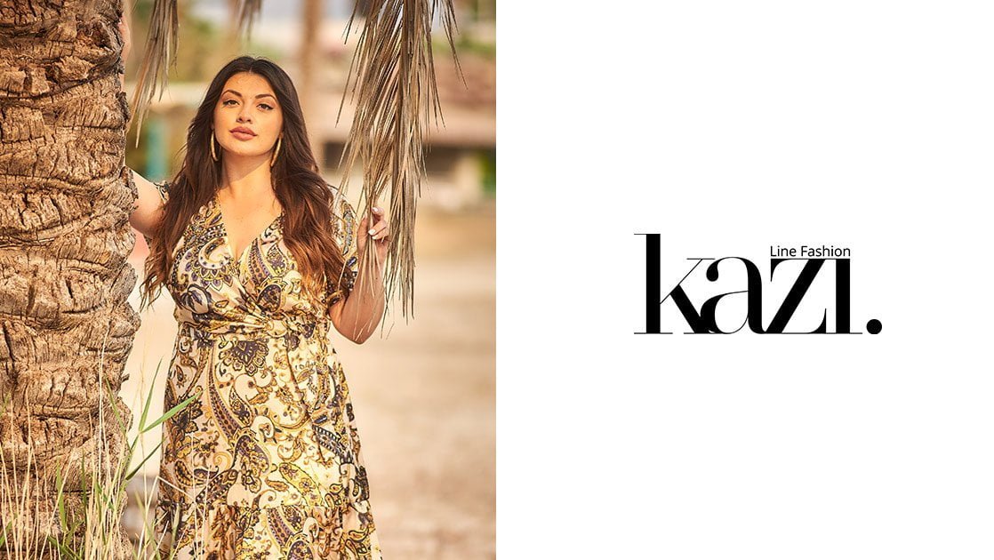
The new logo reflects the modern aesthetic incorporating the years of operation of the Kazi Line Fashion company in the field of fashion. The logo’s sharp outlines symbolise the curves of the female body.
Keeping in mind a balanced design, we created a playful feeling by adding different widths and distances to each letter.
Kimon
Plastic Heels
The culture of Plastic Heels is to offer in the field of women’s & men’s footwear an exclusive service to each individual customer. Through a multitude of personalised options, the customer has the opportunity to obtain the exclusive service that his business needs.
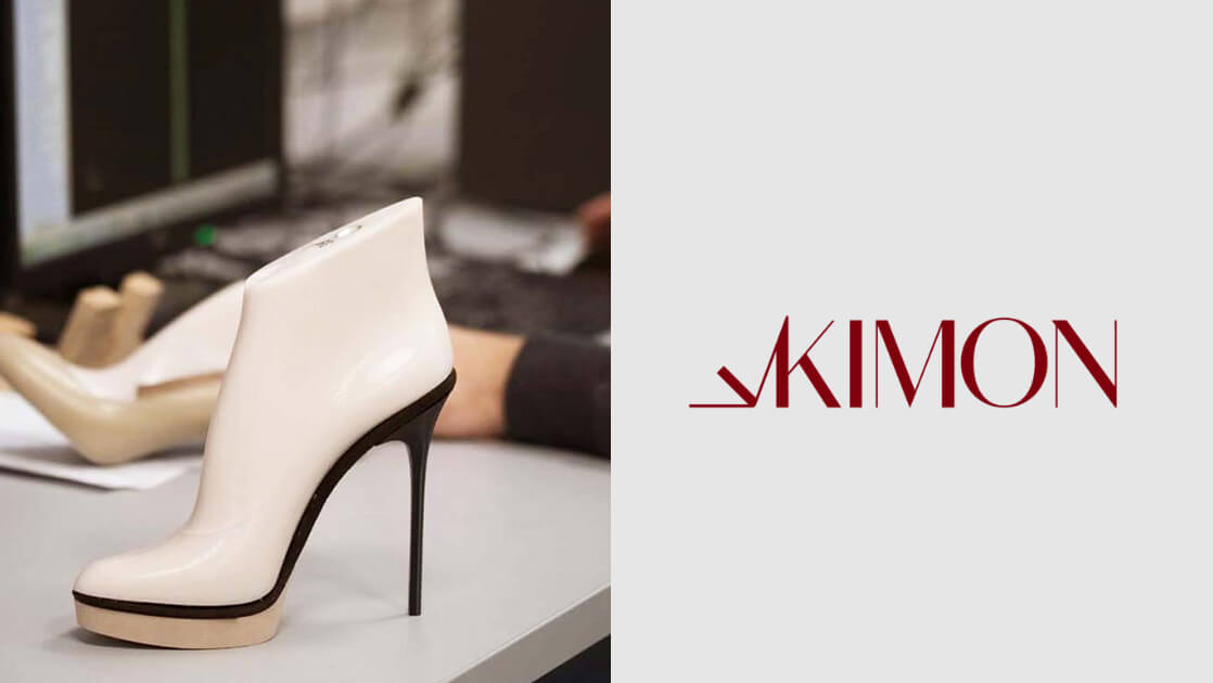
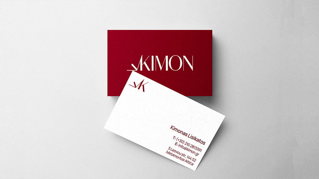
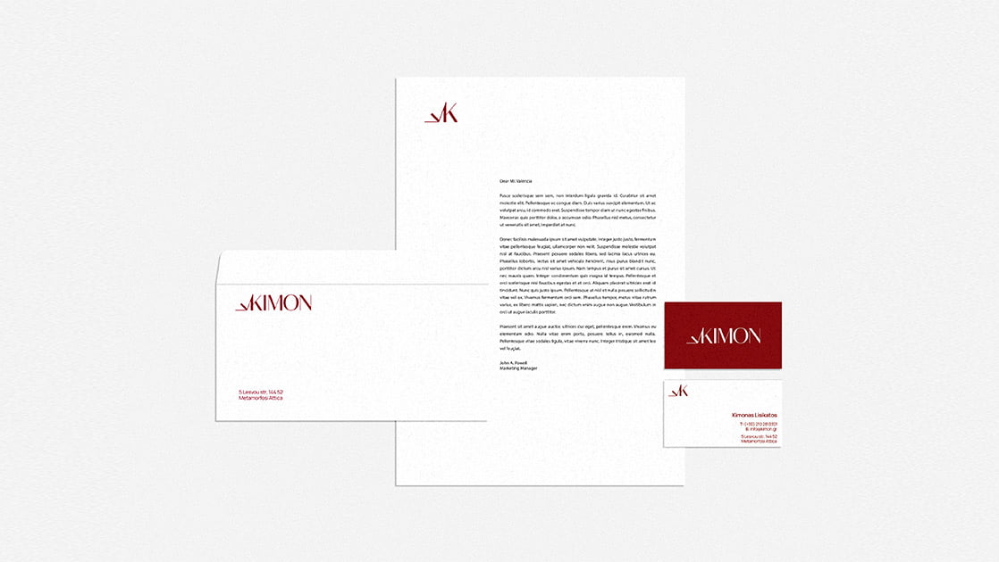
The characteristic red of the logo indicates the premium quality of the constructions, the dynamism of a company with long experience in the field, as well as its evolution over the years. The classic yet modern features of the business are expressed through an equally classic yet modern font.
Manetas
Pharmacy
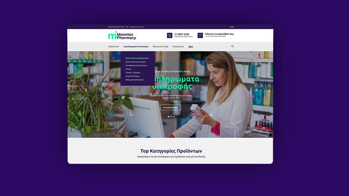
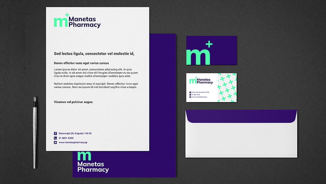
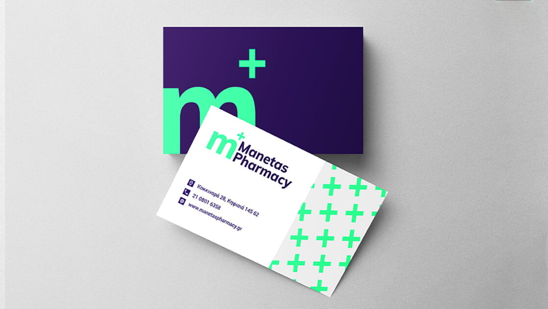
Manetas Pharmacy is a modern pharmacy with a long presence and a clear vision in the health field. Its corporate brand identity could only be created with these elements in mind.
The use of an iso-thick font shows the clarity and dynamism of the company, while the colours chosen testify to the modern but at the same time stable character of the pharmacy.

Finally, m+, inspired by the name of the pharmacy’s founder Sotiris Manetas and the cross, a symbol with a long tradition in the health field, is definitely the cornerstone of Manetas Pharmacy’s corporate identity.
Things for You
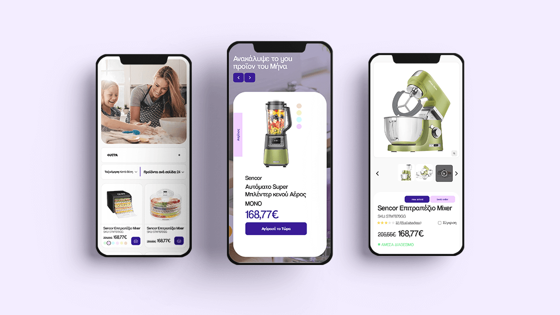
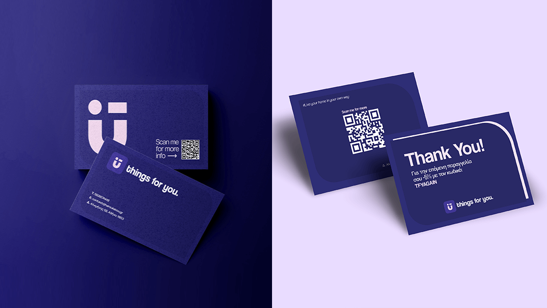
Accompanying the brand’s motto “Live your home your own way”, Things for You provides smart solutions and easy service to the modern Greek consumer, who wishes to have a beautiful & practical home. Its philosophy is to offer the public special ergonomic benefits for everyone.

The inspiration for the characteristic smile of the logo came from the feeling and the smile on peoples’ faces, when we have the right help with modern and functional equipment, for our daily tasks in our house.
Through our playful and lively colours, we communicate to web hosts of all ages the joy and ease that these tasks hide, when done with the right household appliances.
Kleos
Earthy Identity with Modern Aesthetics
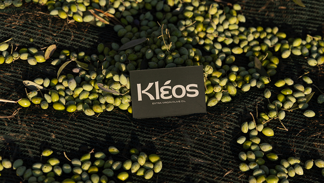
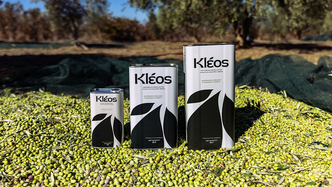
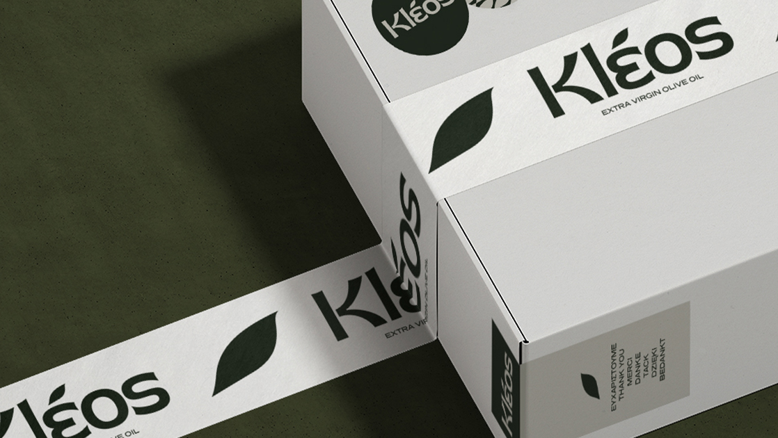
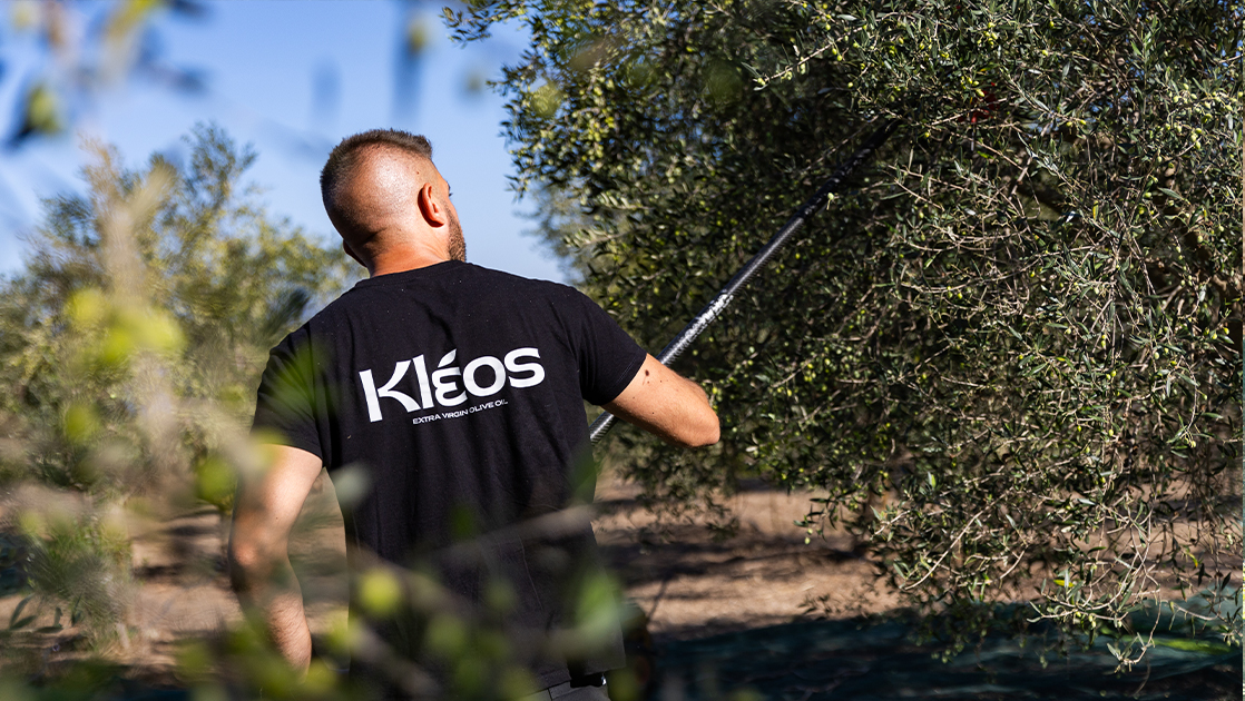
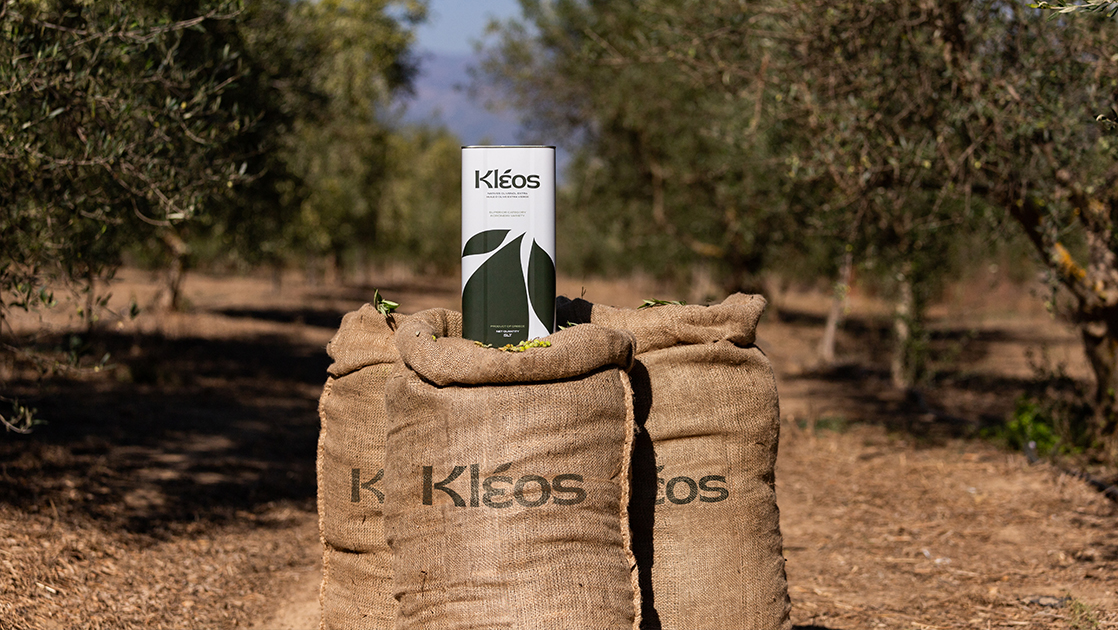
The Kleos logo features geometric balance and solidity, subtly incorporating elements such as the Greek letter epsilon and an olive branch, symbols of tradition, heritage, and the earth.
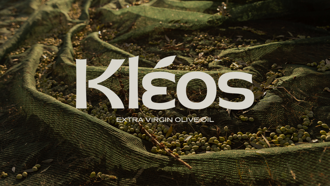
The color palette leans towards earthy tones, while the minimalist packaging enhances the sense of authenticity, naturalness, and timeless quality. The design conveys clarity and respect for the product, communicating the brand’s values with precision.
Palladion
Modern and Bold Visual Identity
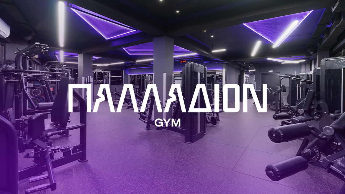
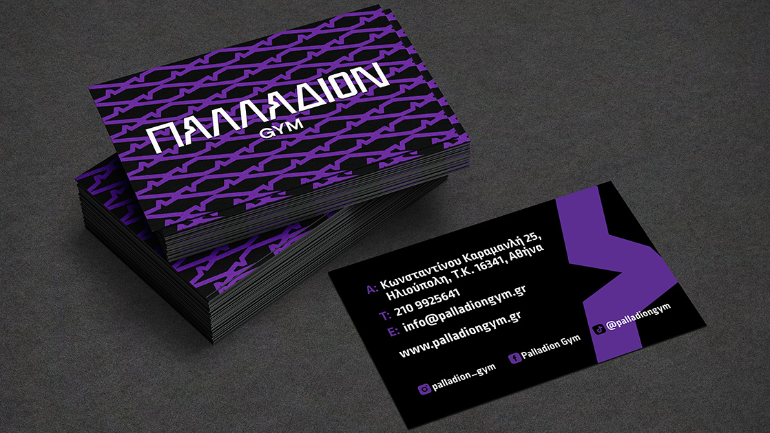
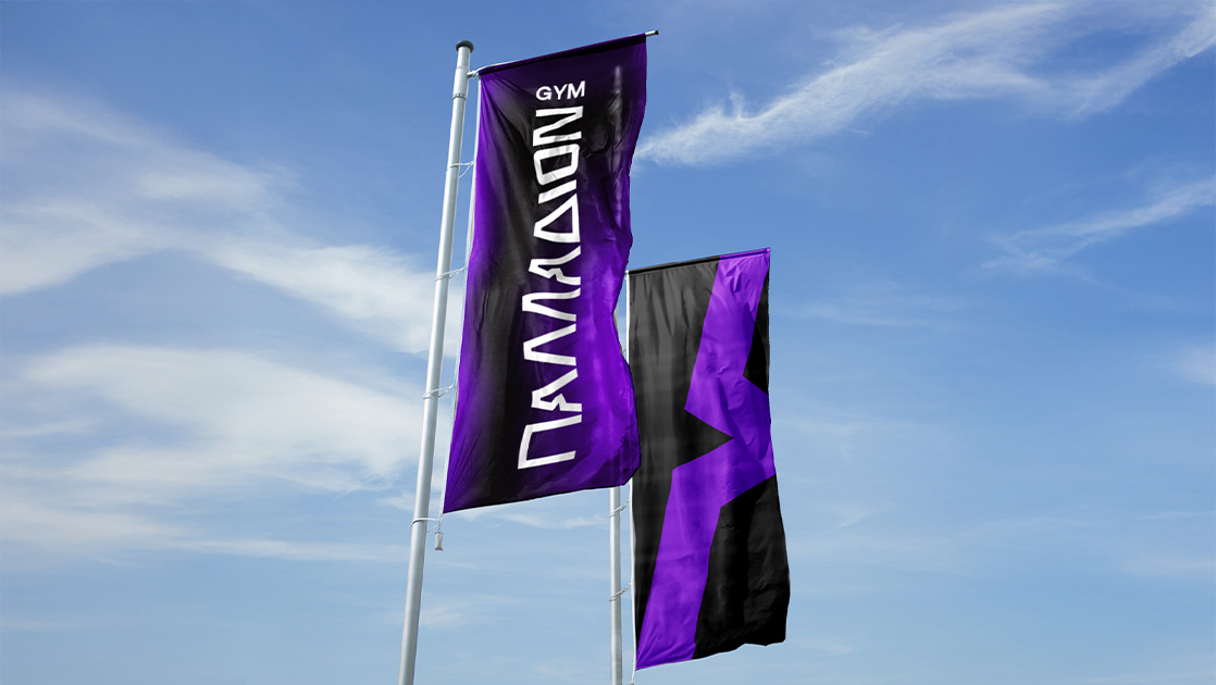
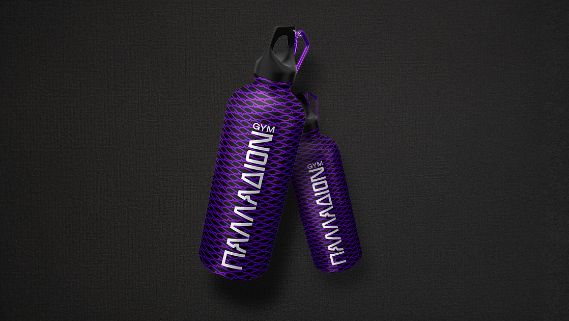
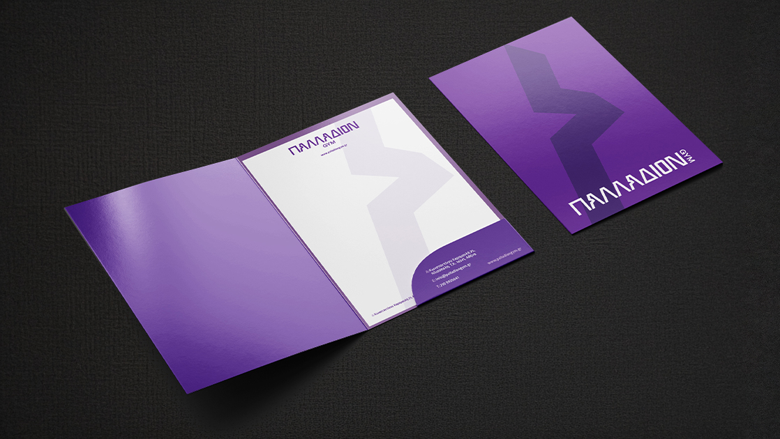
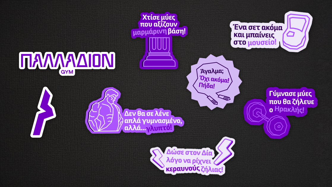
The new logo combines strict geometry with Greek elements, conveying strength, decisiveness, and timeless aesthetics. The color palette, based on rich shades of purple and black, builds a recognizable and energetic identity that exudes power and sophistication.
The design enhances the brand’s presence through a sharp yet refined aesthetic, with clean lines and dynamic composition.
The approach is modern, yet deeply rooted in Greek references. Our goal was to represent a business with a strong identity that inspires trust, stability, and vision.
Paulter
Exploration with Style and Ergonomics
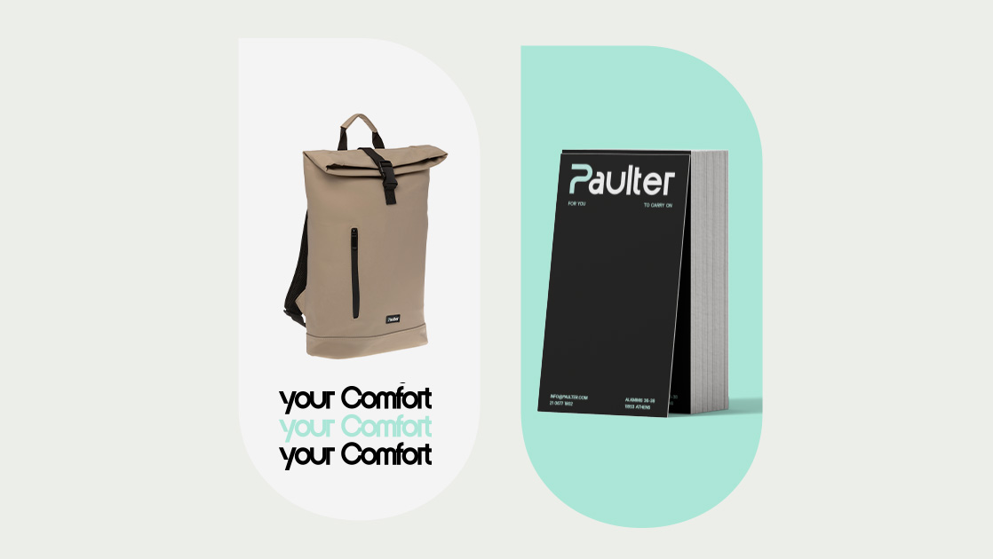
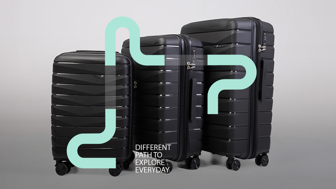
Paulter is a new brand specializing in luggage and backpacks, designed for comfort, practicality, and modern aesthetics. Each product combines ergonomics with contemporary design to meet the needs of today’s traveler.

The logo features a distinctive “P” that resembles a path or road, evoking the concept of movement and exploration. The rest of the word is presented in a rounded, balanced font with elegant curves and clean lines.
The color palette combines mint green, which imparts freshness, youthfulness, and a technological vibe, with black and gray, which enhance the sense of sophistication, balance, and durability

Stamatiou Maxakoulis
Merger with a New Dynamic
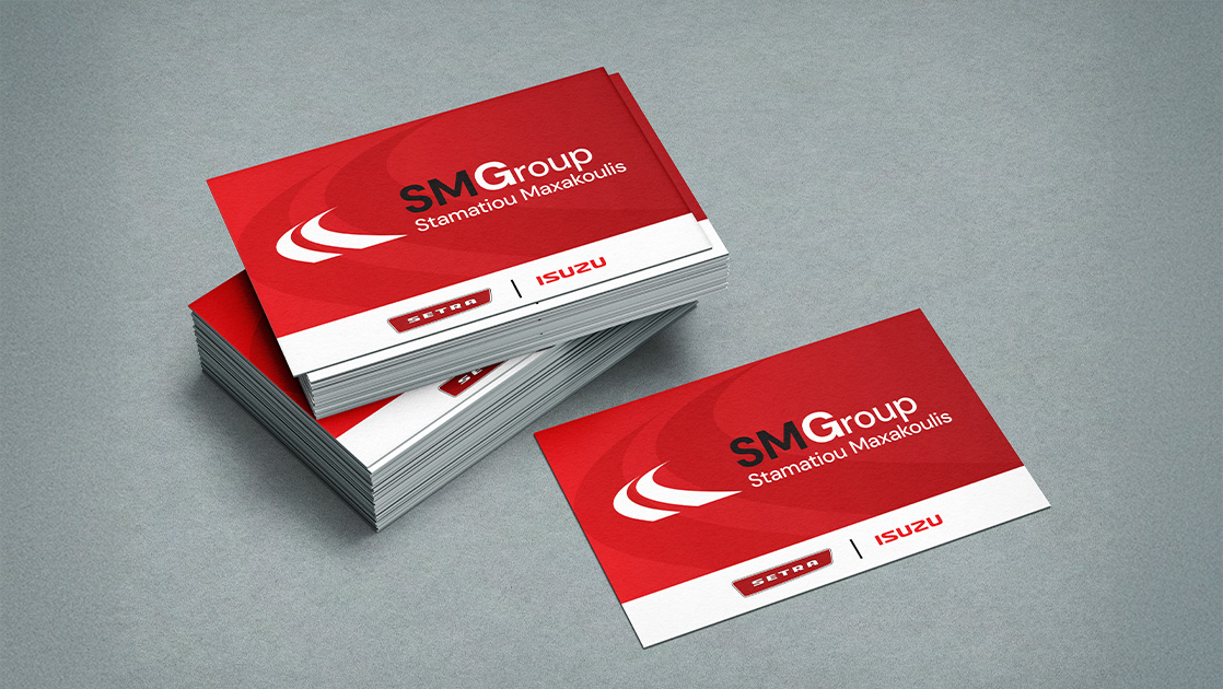
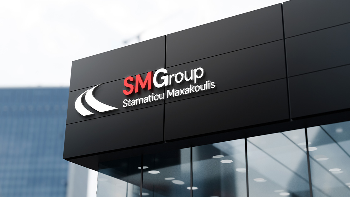
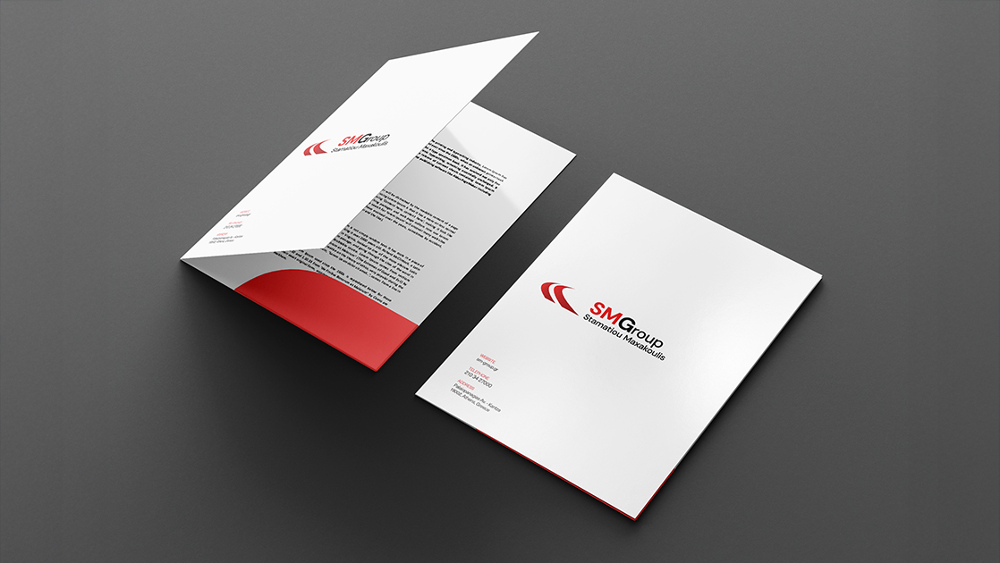
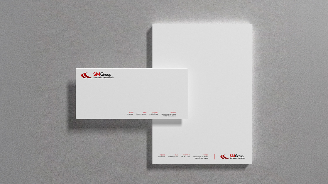
The merger of the transportation companies Stamatiou and Maxakoulis led to the creation of the SMG Group, which redefines its image through a modern and dynamic corporate identity.
The new image maintains a connection to the roots of the two brands while also emphasizing their strategic unity and shared future direction. The color palette features two dominant tones: red, symbolizing energy, action, and vitality, and black, representing strength, luxury, and professionalism.

The SMG acronym stands out with a bold font and clear hierarchy, while the distinctive red curve serves as a symbol of flow, speed, and direction, key characteristics of the transportation industry.
The logos of the two companies are visually united through a common graphic element, creating a cohesive and integrated identity that blends experience with innovation.
STGM
Hotel Project Management with Precision and Dynamism
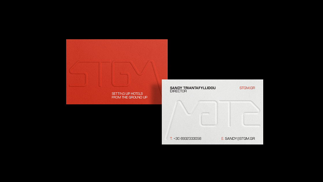
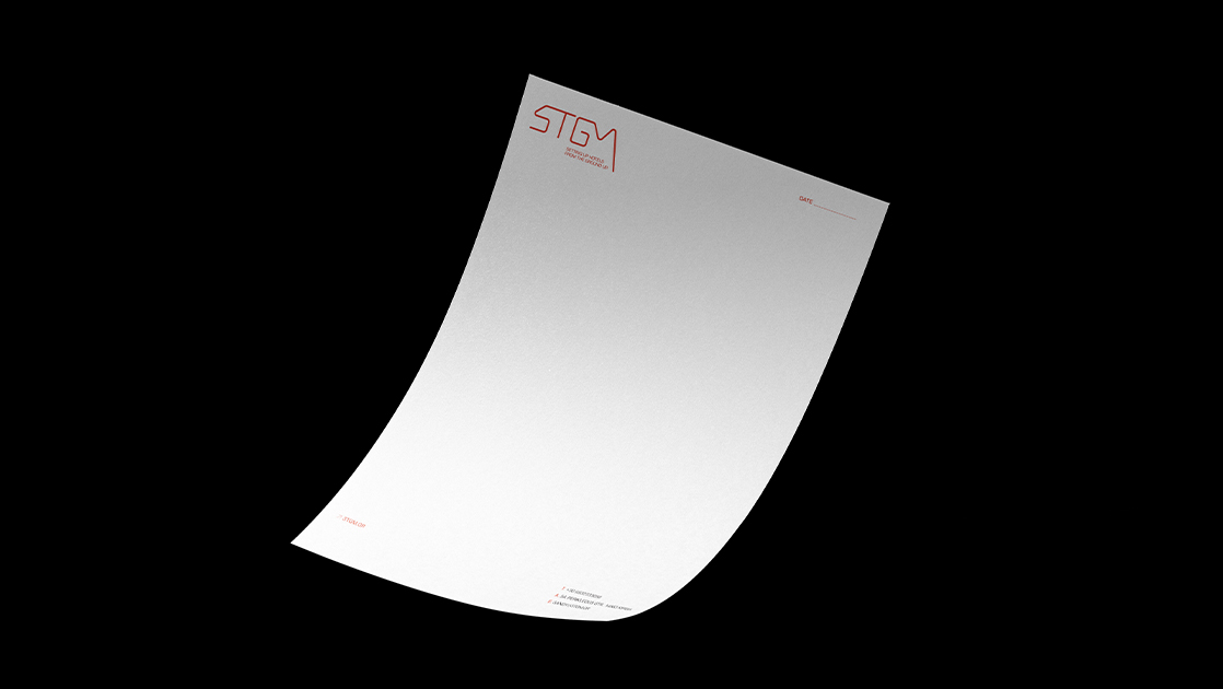
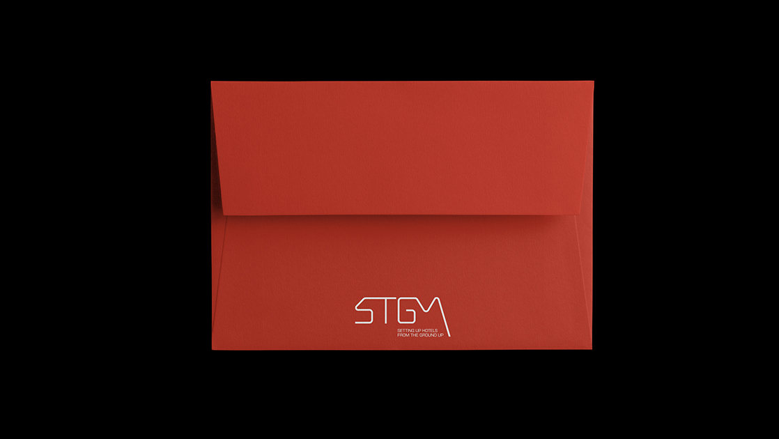
STGM is a specialized Hotel Project Management company that acts as a proxy for the owner, overseeing the coordination and implementation of every hotel project with precision, creativity, and dedication.
The company’s corporate identity is based on a combination of colors with strong symbolism: orange, representing energy, initiative, and momentum, and deep black, conveying prestige, stability, and clarity in communication.
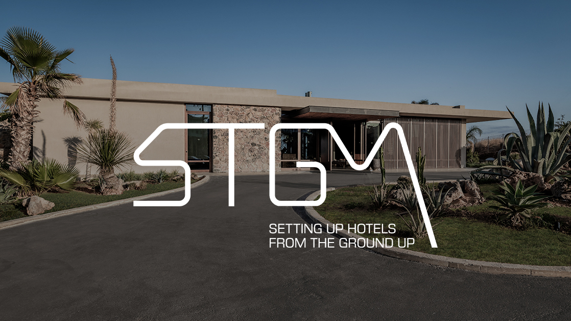
The logo is modern, flexible, and dynamic, inspired by architectural elements and premium design principles. It reflects the professionalism and creative thinking required in hotel design.
Tzous Bar
Rebranding with Urban Style and Pop Aesthetic
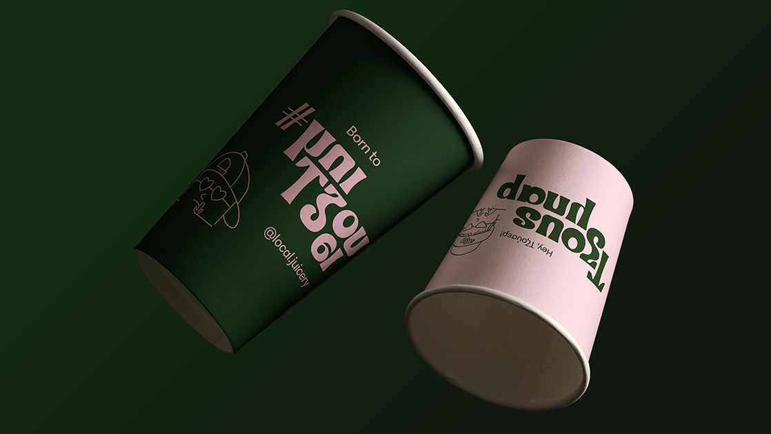
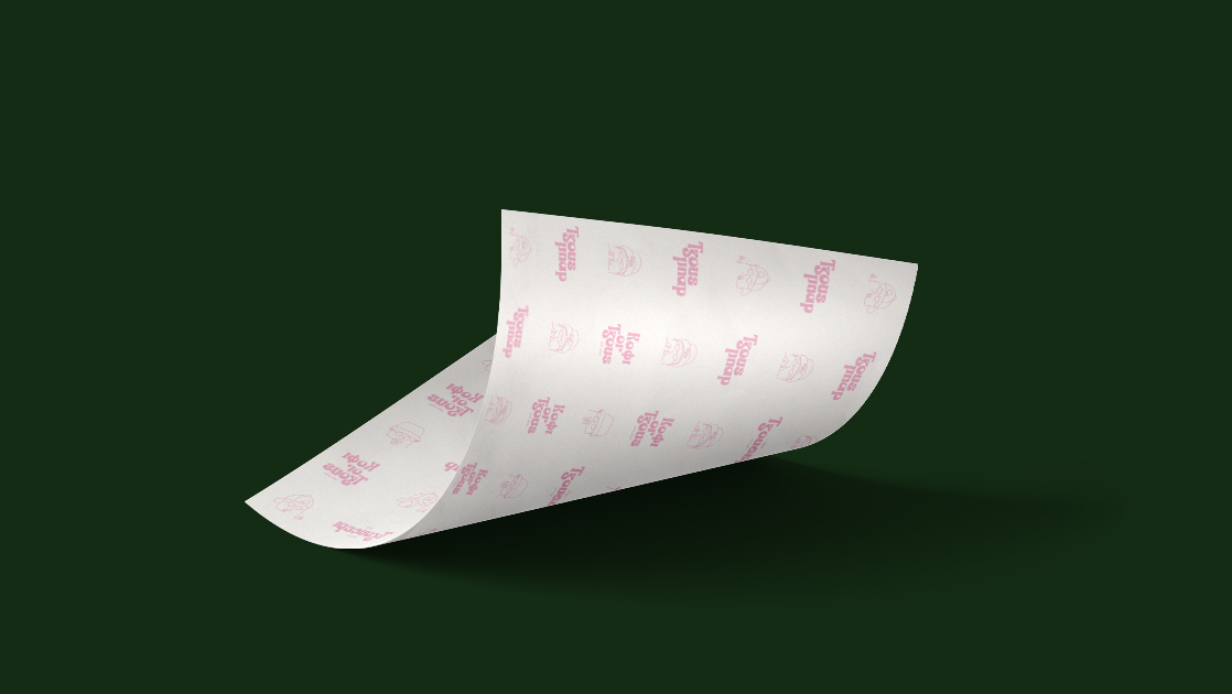
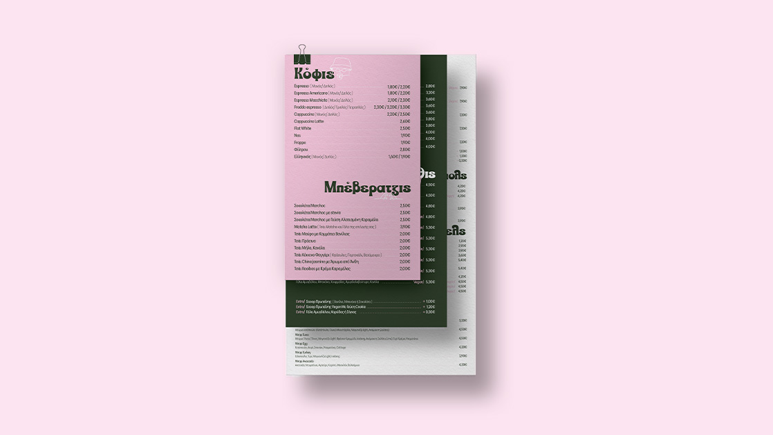
Local Juice & Coffee has rebranded to Tzous Bar, unveiling a new identity that combines an urban character with the feel-good vibe of pop culture. The rebranding expresses freshness and contemporary urban life with a playful tone and youthful spirit. The brand design is minimalist, featuring pastel colors, bold fonts, sketches, and humorous elements. The result is a visual system that communicates directly, warmly, and positively.
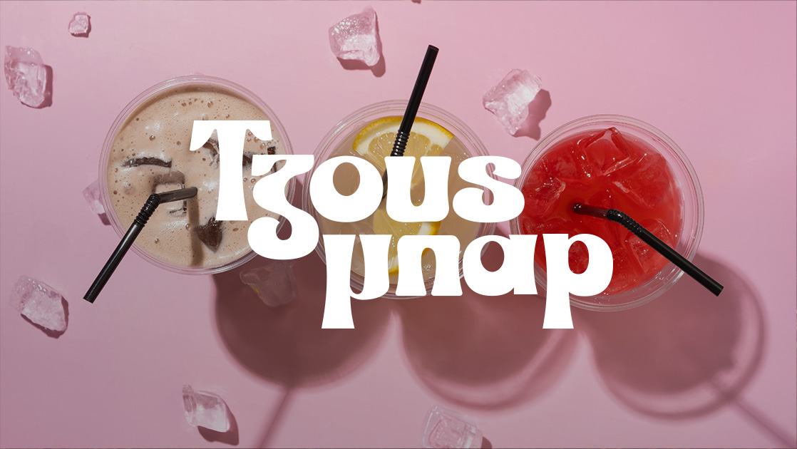
The new identity highlights the social and spontaneous character of Tzous Bar, creating a space where fun and daily enjoyment coexist in every sip.


- Azera
-
Azera
A new era of Holistic Care
AZera’s philosophy is to bring out the best version of yourself through a premium experience and a holistic A-Z care of its luxury beauty care products.

The predominant nude tones indicate the naturalness of self care and clean skin. The integrated care that the person receives is expressed in the moon of the logo. A moon, which manifests the completion that one feels after a proper day of beauty care, as well as the new favourable beginning found ahead.


- Dimorea
-
Dimorea
From the heart of the Peloponnese to the tables of those looking for quality in their diet. The organic extra virgin olive oil di Morea represents everything that is found in the Greek tradition.

Respect for the natural-resources, purity, flawless quality & traditionally following all stages of the production process are the main pillars on which both the product itself and the brand behind di Morea were built. The curves of the logo are driven by the convexity of the olive fruit while the edges of the logo’s font represent the roots of an olive tree, therefore the roots of a family where their philosophy stands on.


- Kazi Line
-
Kazi Line
We love curves
For the woman who doesn’t go unnoticed, for the one who laughs a lot, for the one who knows that femininity, beauty and expression fascinate and transcend in every size. The Kazi Line Fashion brand was built around a real woman who enjoys every moment and doesn’t settle for anything less than what she deserves.

The new logo reflects the modern aesthetic incorporating the years of operation of the Kazi Line Fashion company in the field of fashion. The logo’s sharp outlines symbolise the curves of the female body.
Keeping in mind a balanced design, we created a playful feeling by adding different widths and distances to each letter.


- Kimon
-
Kimon
Plastic Heels
The culture of Plastic Heels is to offer in the field of women’s & men’s footwear an exclusive service to each individual customer. Through a multitude of personalised options, the customer has the opportunity to obtain the exclusive service that his business needs.

The characteristic red of the logo indicates the premium quality of the constructions, the dynamism of a company with long experience in the field, as well as its evolution over the years. The classic yet modern features of the business are expressed through an equally classic yet modern font.


- Manetas
-
Manetas
Pharmacy
Manetas Pharmacy is a modern pharmacy with a long presence and a clear vision in the health field. Its corporate brand identity could only be created with these elements in mind.
The use of an iso-thick font shows the clarity and dynamism of the company, while the colours chosen testify to the modern but at the same time stable character of the pharmacy.

Finally, m+, inspired by the name of the pharmacy’s founder Sotiris Manetas and the cross, a symbol with a long tradition in the health field, is definitely the cornerstone of Manetas Pharmacy’s corporate identity.


- Things for You
-
Things for You
Accompanying the brand’s motto “Live your home your own way”, Things for You provides smart solutions and easy service to the modern Greek consumer, who wishes to have a beautiful & practical home. Its philosophy is to offer the public special ergonomic benefits for everyone.

The inspiration for the characteristic smile of the logo came from the feeling and the smile on peoples’ faces, when we have the right help with modern and functional equipment, for our daily tasks in our house.
Through our playful and lively colours, we communicate to web hosts of all ages the joy and ease that these tasks hide, when done with the right household appliances.


- Kleos
-
Kleos
Earthy Identity with Modern Aesthetics
The Kleos logo features geometric balance and solidity, subtly incorporating elements such as the Greek letter epsilon and an olive branch, symbols of tradition, heritage, and the earth.

The color palette leans towards earthy tones, while the minimalist packaging enhances the sense of authenticity, naturalness, and timeless quality. The design conveys clarity and respect for the product, communicating the brand’s values with precision.


- Palladion
-
Palladion
Modern and Bold Visual Identity
The new logo combines strict geometry with Greek elements, conveying strength, decisiveness, and timeless aesthetics. The color palette, based on rich shades of purple and black, builds a recognizable and energetic identity that exudes power and sophistication.
The design enhances the brand’s presence through a sharp yet refined aesthetic, with clean lines and dynamic composition.

The approach is modern, yet deeply rooted in Greek references. Our goal was to represent a business with a strong identity that inspires trust, stability, and vision.


- Paulter
-
Paulter
Exploration with Style and Ergonomics
Paulter is a new brand specializing in luggage and backpacks, designed for comfort, practicality, and modern aesthetics. Each product combines ergonomics with contemporary design to meet the needs of today’s traveler.

The logo features a distinctive “P” that resembles a path or road, evoking the concept of movement and exploration. The rest of the word is presented in a rounded, balanced font with elegant curves and clean lines.
The color palette combines mint green, which imparts freshness, youthfulness, and a technological vibe, with black and gray, which enhance the sense of sophistication, balance, and durability


- Stamatiou
-
Stamatiou Maxakoulis
Merger with a New Dynamic
The merger of the transportation companies Stamatiou and Maxakoulis led to the creation of the SMG Group, which redefines its image through a modern and dynamic corporate identity.
The new image maintains a connection to the roots of the two brands while also emphasizing their strategic unity and shared future direction. The color palette features two dominant tones: red, symbolizing energy, action, and vitality, and black, representing strength, luxury, and professionalism.
The SMG acronym stands out with a bold font and clear hierarchy, while the distinctive red curve serves as a symbol of flow, speed, and direction, key characteristics of the transportation industry.
The logos of the two companies are visually united through a common graphic element, creating a cohesive and integrated identity that blends experience with innovation.


- Stamatiou
-
STGM
Hotel Project Management with Precision and Dynamism
STGM is a specialized Hotel Project Management company that acts as a proxy for the owner, overseeing the coordination and implementation of every hotel project with precision, creativity, and dedication.
The company’s corporate identity is based on a combination of colors with strong symbolism: orange, representing energy, initiative, and momentum, and deep black, conveying prestige, stability, and clarity in communication.

The logo is modern, flexible, and dynamic, inspired by architectural elements and premium design principles. It reflects the professionalism and creative thinking required in hotel design.


- Tzous Bar
-
Tzous Bar
Rebranding with Urban Style and Pop Aesthetic
Local Juice & Coffee has rebranded to Tzous Bar, unveiling a new identity that combines an urban character with the feel-good vibe of pop culture. The rebranding expresses freshness and contemporary urban life with a playful tone and youthful spirit. The brand design is minimalist, featuring pastel colors, bold fonts, sketches, and humorous elements. The result is a visual system that communicates directly, warmly, and positively.

The new identity highlights the social and spontaneous character of Tzous Bar, creating a space where fun and daily enjoyment coexist in every sip.


Your goals deserve the right digital strategy.
Together we will design the solution that suits you.
Frequently Asked Questions (FAQ)
What does a complete brand identity include?
A complete brand identity includes the logo, color palette, typography, primary and secondary graphic elements, tone of voice, and applications across print and digital media. It typically covers 8–12 core assets that ensure consistency across every brand touchpoint. At DigitalUp, we develop full brand systems that guarantee cohesive and consistent communication.
What is brand identity and why is it important?
Brand identity is the visual and verbal expression of how a business presents itself to its audience. It is crucial because it shapes recognition, trust, and perceived quality. Studies show that brands with consistent identity achieve up to 3× higher brand recall and up to 20% better performance in digital campaigns.
How can I create a brand identity for my business?
The process includes market analysis, defining the brand personality, designing the logo, selecting colors and typography, and developing the core visual applications. The final step is creating brand guidelines that ensure consistent use across all channels. At DigitalUp, we handle the entire process from strategy to final implementation.
How much does it cost to create a complete brand identity?
The cost depends on the scope of deliverables, the level of strategic work required, and the specific needs of the business. A full brand identity varies in price depending on the number of assets and applications included. We provide a tailored proposal after a brief assessment of your goals and brand requirements.
What is the difference between a brand identity and a logo?
A logo is only one component of a brand identity. Brand identity includes the entire visual and verbal system of the brand: colors, fonts, imagery style, tone of voice, usage rules, and applications. Simply put: the logo is the symbol the brand identity is the entire experience.
How are the right colors chosen for a brand?
Color selection is based on color psychology, the target audience, and the brand’s strategic positioning. Each color communicates different emotions and values, and the right palette can increase brand recognition by up to 80%. At DigitalUp, we create color systems that balance aesthetics, functionality, and brand differentiation.

 by
by 
